Landscape and garden designers base their efforts on a number of principles, including form, line, texture, scale, and color. Secondary principles that rely on the five main principles include proportion, transition, and unity.
Knowing a little about basic color theory, then, is indispensable to anyone wanting to understand how successful landscapes are designed, especially DIY homeowners hoping to create a landscape or garden that is pleasing to the eye.
Color in Context
Your choice of colors to be used in the yard should not be considered in isolation. Always keep in mind how color interplays with the colors of other basic elements, with the other
principles of landscape design, and with the overall objectives of your plan.
Remember, too, that color, along with the other essential design elements, applies not only to the overall landscape but also to garden beds and planting areas within the landscape. In an individual flower garden bed, the principles of line, form, texture, scale, color, proportion, transition, and unity also apply on an individual scale. The only difference may be that color is even more important in a garden, since this is the place where we usually want color to be the star.
The Color-Wheel Categories
Color theory in design is based on the
color wheel, a standard circular illustration that shows the relationship between all the various colors of the spectrum. The spectrum of colors is often divided into four categories:
- Primary colors: reds, yellows, and blues
- Secondary colors: greens, violets (purples), and oranges
- Tertiary colors: Blends of the primary and secondary categories
- Neutral colors: White, grays, and silvers. Gray is an unusual color for blooms or berries, but an example is to be found on bayberry shrubs.
The secondary colors are produced by blending two primary colors in equal proportions. Thus, red and yellow combine to produce orange, yellow and blue produce green, and red and blue yield purple.
The blends known as "tertiary colors" add a further element of complexity to the color wheel. They are combinations of primary with secondary colors, producing not entirely different colors, but colors that include qualities of both:
- Yellow-green
- Blue-green
- Blue-violet
- Red-orange
- Orange yellow
The Spruce / Evgeniya Vlasova
Combining Colors
Using color theory as your guide, you can choose the colors you use in your landscaping so that they "go together" to produce different effects. This can be done in a number of ways.
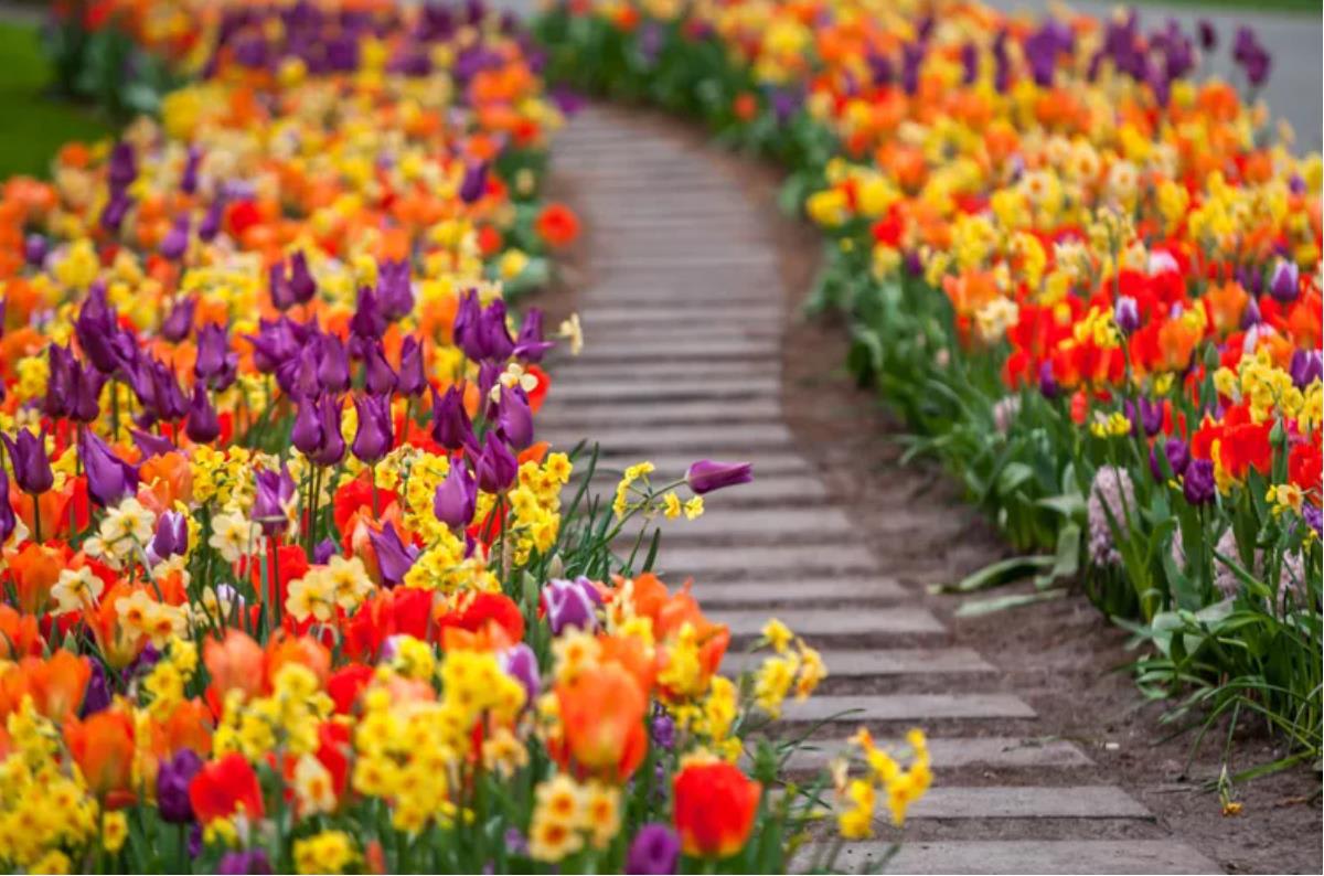
Cool Colors vs. Warm Colors
One common way of categorizing the colors of the spectrum is by dividing them into warm colors and cool colors. This categorization is often used to influence mood and perception in a landscape. Blue purple and green are considered "
cool colors" and their impact on viewers tend to be relaxing and calming. Thus, for a meditation garden, blue and/or
purple flowers are logical choices. Red, yellow, and orange are considered "
warm colors," and they tend to excite and invigorate the viewer. In addition to using the warm/cool qualities to influence mood, warm and cool colors can be used for other effects:
- In a small yard, combining warm and cool colors can change the perception of depth. Place flowers with warm colors in the foreground. Behind them, position flowers with cool colors, starting with darker shades (such as purple), followed by shades that are successively lighter. This will create an illusion of depth. You can also create this illusion by placing larger plant material in the foreground, then tapering off the size of your plants as you work your way in deeper. The effect is to make the garden seem much larger and deeper than it actually is.
- Warm colors like red can make overly large spaces seem smaller and more intimate. The warm colors appear to come forward in the landscape and seem closer than they are in reality—thereby scaling down the whole landscape in the process.
- The warm colors are born attention-grabbers since they bring a mood that arouses rather than relaxes. To draw visitors into a space, create a focal point using red, yellow, or orange—or all three.
The Spruce / Evgeniya Vlasova
Unity and Contrast
Another application of color theory can be seen in the use of color to create either unity or contrast. Landscapers may stay within the warm-colors group or the cool-colors group in order to provide
unity, whether it is within one
planting bed or throughout the yard. In the latter case, different parts of the yard can be tied together to form a harmonious unit.
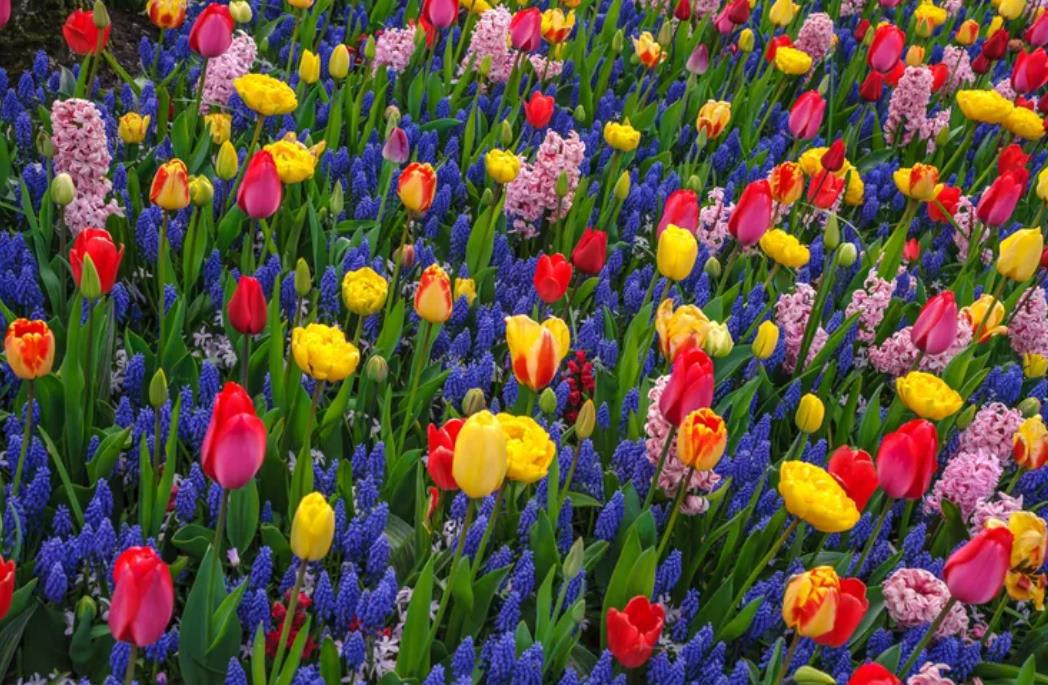
An unusual form of unity occurs when pairs of colors are chosen that lie exactly across from one another on the color wheel. You might expect that such colors would be viewed as contrasting, but in reality, these pairs produce a reassuring and "right" feel to viewers. These are known as complementary pairs. There are three pairs of complementary primary colors, including:
- Yellow and blue
- Blue and orange
- Red and green
Shifting directions on the color wheel gives another set of complementary colors:
- yellow-orange and purple
- orange-red and blue-green
- red-purple (pink) and green-yellow
Any number of complementary pairs can be determined simply by shifting positions on the color wheel, but for the purposes of planning flower-color combinations, designers usually confine their discussions to the primary and secondary colors.
Complementary color pairs are thought to be pleasing in part because they highlight and intensify the experience of their opposites. Thus, this is one form of contrast that works very well in your landscape.
When color pairs are used that have no discernible relationship on the color wheel, the contrasting effect can be a bit jarring, and the pairing is sometimes said to be clashing. But there may be occasions when you simply have a great fondness for two colors and want to use them in a garden. The tertiary colors can then serve as transitional colors in such situations. For example, if you want a garden color scheme using reds and violets because they are favorite colors, a plant or flower with a red-violet color can help bridge the gulf between the two colors. In this situation, the addition of the third plant color makes the difference between a slightly jarring effect and a smoother, more harmonious ensemble.
The Spruce / Evgeniya Vlasova
Using Neutrals
Neutral colors can also be used to soften the effect of loud color schemes or stand on their own
in a monochromatic scheme. True blacks are rare in gardens and landscapes, but all-white gardens consisting of various shades of whites and creams are sometimes used in so-called moon gardens, which are designed to be enjoyed at night.
Using Color Theory in Gardening
Though not easy, using color theory in designing the hardscape of an overall landscape is a learnable skill. Applying these skills to a garden can be somewhat more tricky, since Mother Nature doesn't always cooperate with our abstract plans for how color should work. Not all plants will automatically bloom during the same season, and
foliage color also changes from season to season in some cases. And the structure of a garden will change over time, as shrubs grow and perennial plants mature and spread.
For example, the
black-eyed Susans you chose for their warm deep yellow tones won't contribute that color at all in spring, but will provide it in ample amounts in late summer and fall. You may need to add spring-blooming daffodils to provide that yellow pop in the spring time; they will quickly fade and make room for other plants. Thus, there is an unavoildable element of time that enters into garden design, which is not really present for designers working on interior spaces. When designing a color scheme, always learn about blooming times in your region before buying plants.
Matters are perhaps most difficult for flower gardeners aiming at a particular color scheme for fall, since most flowering plants are naturally prone to delivering their flowers in spring or summer. Even
chrysanthemums, the most popular autumn flower, have to be coaxed into attaining the familiar form by nurseries who carefully control the lighting conditions. Potted fall mums that are then planted in the ground will revert to flowering in mid-summer. Fall color is often controlled by the selection of plants with notable fall foliage colors, or colorful berries, or both.
But with a little extra planning and work on your part, you can include flowers in your fall color schemes. This can be a matter of choosing species known to flower in fall, or those who have notable fall foliage or berries. Fall color can also be assisted by late planting of some species. Waiting until fall to put in salvia transplants, for example, will spare them the heat of summer that usually destroys the spring-planted salvias. Pansies are another flower that often goes away in mid-summer, but can be planted again for fall. Finally, many plants can have their bloom period extended through diligent deadheading of their spent flowers. For example, lupines that are closely cropped after the summer bloom often come back with a lesser flush of fall flowers.
Here are some suggestions for flowers in particular color groups:
Flowers for Red Blooms
Flowers for Yellow Blooms
Flowers for Blue Blooms
Flowers for Orange Blooms
Flowers for Purple Blooms
Flowers for White Blooms
Flowers for "Black" Blooms or Dark Foliage
Plants for Silver Foliage
Flowers for Pink Blooms
Flowers for Lavender Blooms